 Orange – the second colour of the rainbow and the fusion of its neighbouring colours Red and Yellow.
Consider the big brands that use the colour orange to make a statement of intent !
A symbol of safety, joy, enthusiasm, energy, happiness and creativity. Think about the big brands that have chosen Orange for their corporate colours – no coincidence!
 Where did the colour and name orange originate?
It may not surprise you to learn that orange was actually named after the fruit! Deriving from the old English word ‘Geoluhread’ which meant yellow-red. Like its neighbour Red, it was formed in artwork and paintings by the use of the ochre family.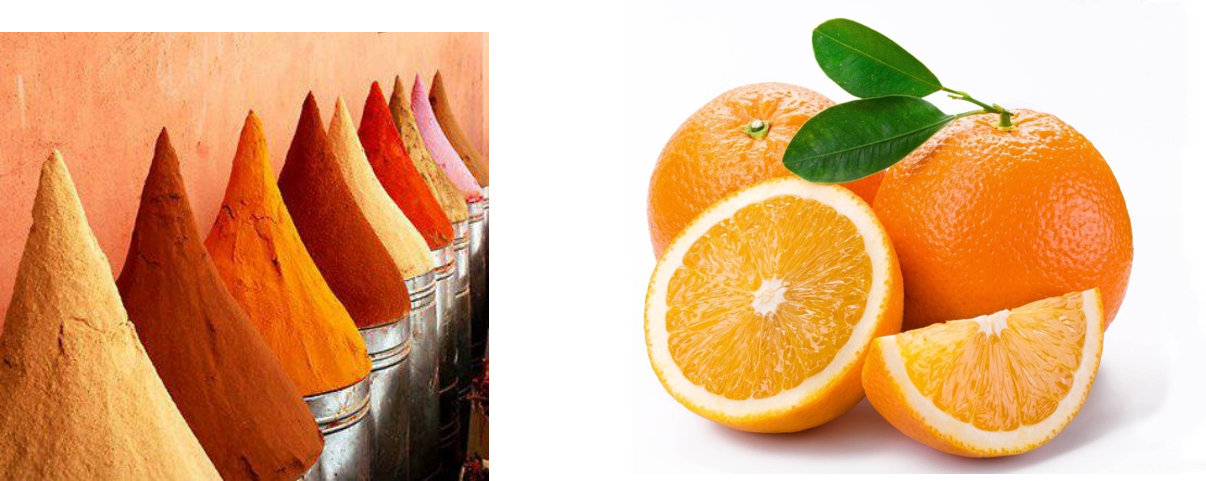
How do we use Orange to create the perfect interior scheme?
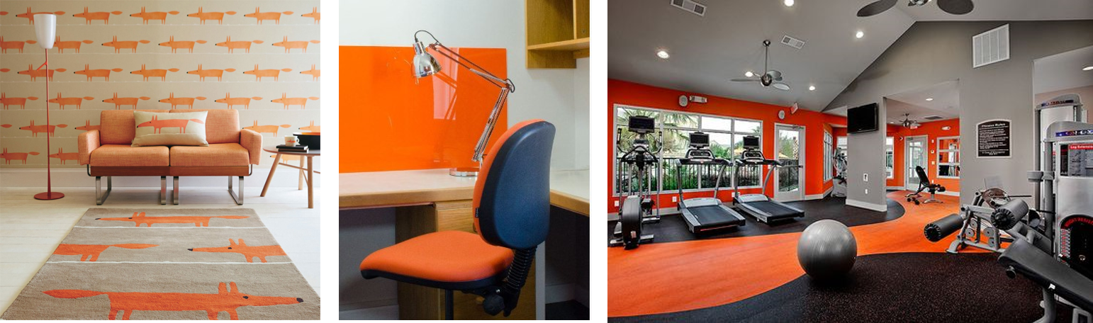
Orange in its strong brightest version, helps to energise a space and give a sense of fun – student accommodation, playrooms and gyms all benefit from orange to keep energy levels on a high!
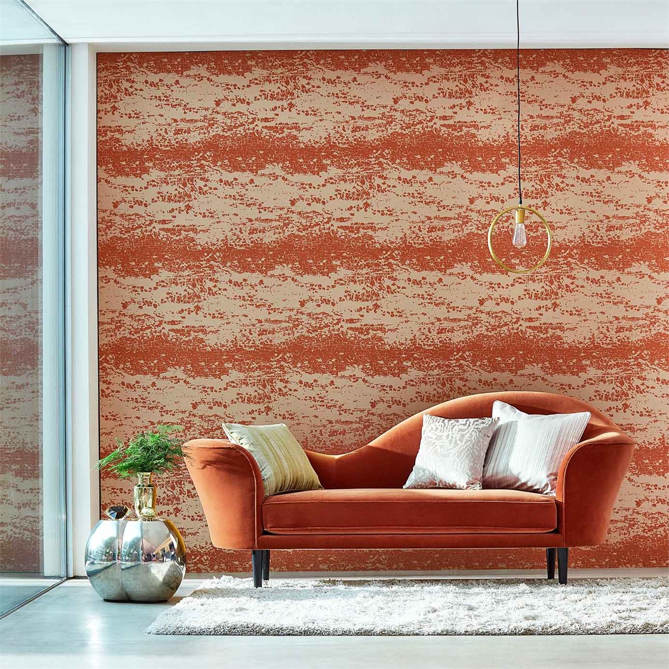
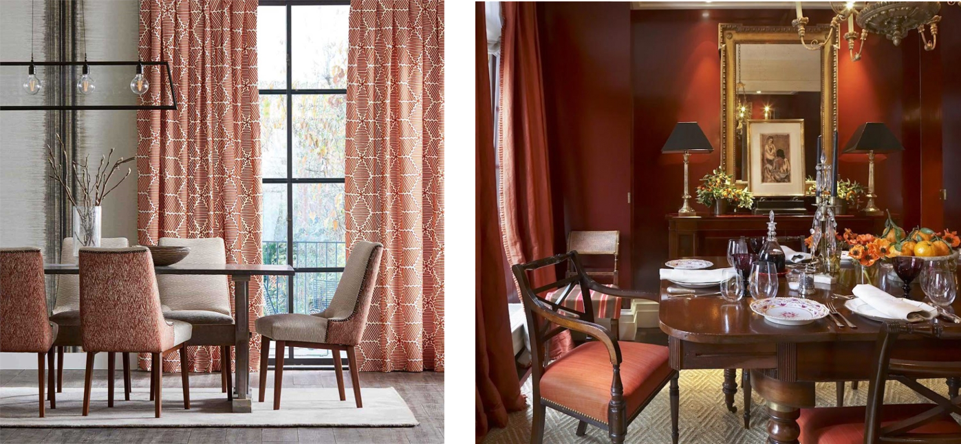
 Using orange in its more earthier tones such as rust and cinnamon, creates a more cosy atmosphere. Like Red, it can stimulate appetite and conversation – perfect for a dining room.
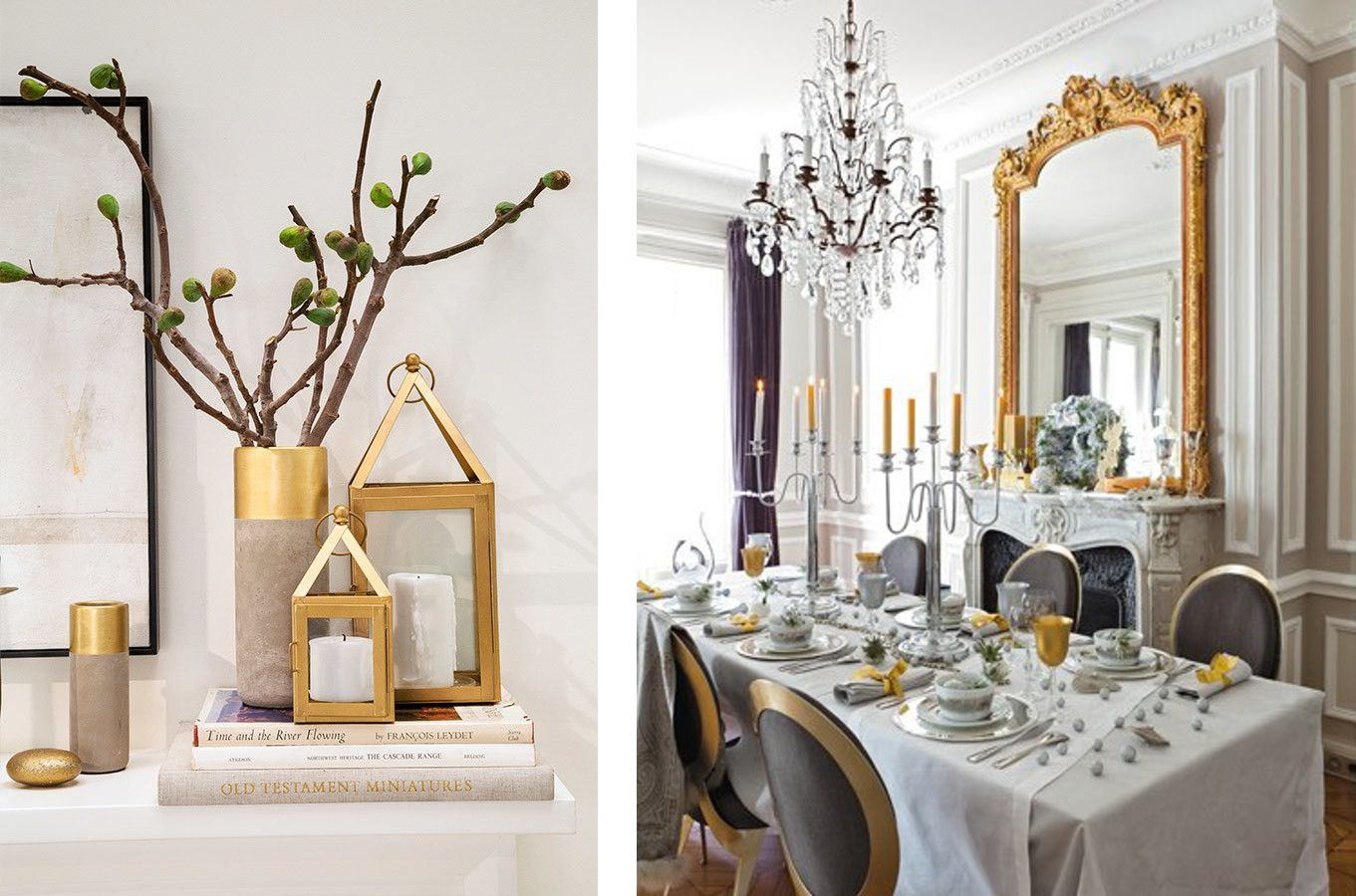
 If you take the lightest hue of orange, then you of come to Gold – a symbol of presitge and opulence. An easy way to add a touch of sunshine to your room with accessories and accent pieces.
 Which colours combine well with Orange for interior schemes?
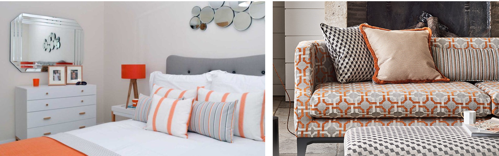
Orange makes a perfect foil for cool neutrals such as grey. Mixed with white it creates a really crisp, refreshing feel. While teamed with different shades of grey it creates a warmer, opulent feel.
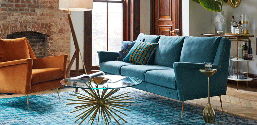
Much like red, orange also works well with shades of turquoise. Whereas red works well with lighter tones like Duck Egg. Orange, because it is not such a dominant colour, works well with stronger shades such as teal.
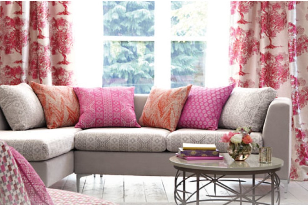
 Orange can also work well with some unlikely bedfellows – pink for instance, provides and lively contrast if you want to create a vibrant feel.
So that’s it – the wonderful sunny shade of Orange!