The right shade of yellow can create a statement, or be soft and relaxing. Yellow can be a vibrant, stunning choice of colour that brightens up any space. There is nothing better than the sun shining through the windows into your home – so why not add a touch of yellow to bring the sunshine indoors.
What impact does yellow have on interiors and our well being?
Yellow symbolises positive psychological qualities such as joyfulness, happiness, optimism and confidence – something we think we all need at this time! Be mindful on the shade of yellow you choose, being surrounded by too much yellow or the wrong shade, can create a sense of anxiety – make sure it’s a shade you feel you can live with!
Farrow and Ball – Babouche
A cheerful yellow
‘Babouche takes its exotic name from the distinctive colour of the leather slippers worn by men in Morocco. It has a cheerful brightness that will intensify when used in large areas, but it is always dignified and never garish. Babouche can be paired with Railings for a very modern but sumptuous effect.’
Where did the colour originate from?
Yellow is the colour between orange and green on the spectrum of visible light. Yellow ochre is one of the oldest pigments in existence. Paintings over 17,000 years old used the natural ochre mineral, clay. The word yellow comes from the Old English, meaning “yellow, yellowish”, derived from the Proto-Germanic word gelwaz “yellow”. It has the same Indo-European base, as the words gold and yell; gʰel- means both bright and gleaming.
 What other colours should be used in a scheme containing yellow?
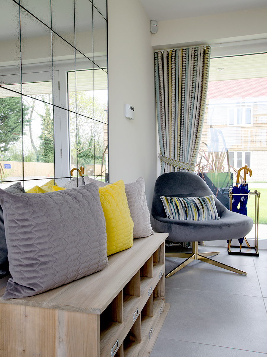
Yellow can be a daunting colour when you decide you want to incorporate it into your home. It’s important to use it with similar tones – grey is a perfect mellow tone to use it with, and isn’t too in-your-face. When teamed together they balance the room in harmony, creating freshness. You can add black accents if you are feeling more daring!


Top tip – Identify your primary colour, secondary colour and accent colour. The key in any interior design scheme is to use the colours in varying proportions.

Yellow can be elegant and sophisticated. In this design we used mellow tones of purple and soft yellows which created a relaxed, traditional feel for a Cotswold cottage.
Are there any rooms that you should avoid using yellow in?
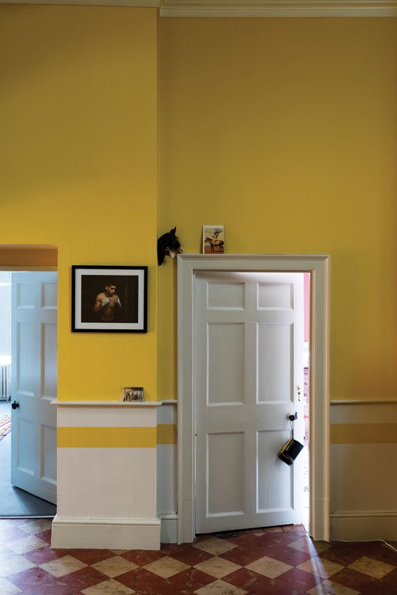
We recommend using yellows in hallways as these areas are usually darker rooms with less natural sunlight, it makes a room welcoming, perfect for introducing guests to your home. Kitchens also work well with the colour yellow, they help create a sunny, positive atmosphere, a great way to start the day!
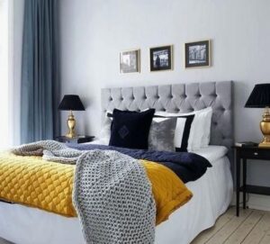
Yellow relates to emotions, as it is one of the psychological primaries. It is best to avoid using yellow in the bedroom. If sleeping in a bedroom with the colour yellow over a long period of time, you may wake up feeling irritable, and restless. Even when you’re asleep the colour can still have impact on your emotions. If you have a young child, then they can be very sensitive to colours so avoid using cream, or yellow.