The colour violet sits at the end of the visible light spectrum or the rainbow as commonly known. It is bluish / purple in colour and although closer to the colour purple, it is a pure colour whereas the colour purple is a mix of reds and blues.
An insight into the colour violet and the feeling it evokes…
The colour violet is said to spark imagination, increase spirituality and expand our awareness. It can be used to heighten a sense of escapism from our everyday lives and touch on a feeling of fantasy within the real world. Violet has been linked to an array of different religions over time and is a colour that is closely connected with royalty, giving an impression of power and wealth.
Violet is also said to give a feeling of harmony and promote mental balance, however; too much of the colour can have the opposite effect and stimulate depression. Therefore, the colour should be used mindfully, carefully and in small amounts in certain environments.
Complementary colours
If you are wanting to incorporate violets and purples into your interiors, as well as taking on board the psychological impact of the colour, it is key to understand the complementary colours and to avoid those that will upset the balance within the scheme.
If you are not sure where to begin, then going back to basics and taking inspiration from the colour wheel is the best way to start. On the colour wheel, the colours sitting opposite one another are known as complementary colours.
In violets case, yellows and greens are a perfect match. 
Drawing inspiration from the nature around us, we can see how well these colours complement each other!
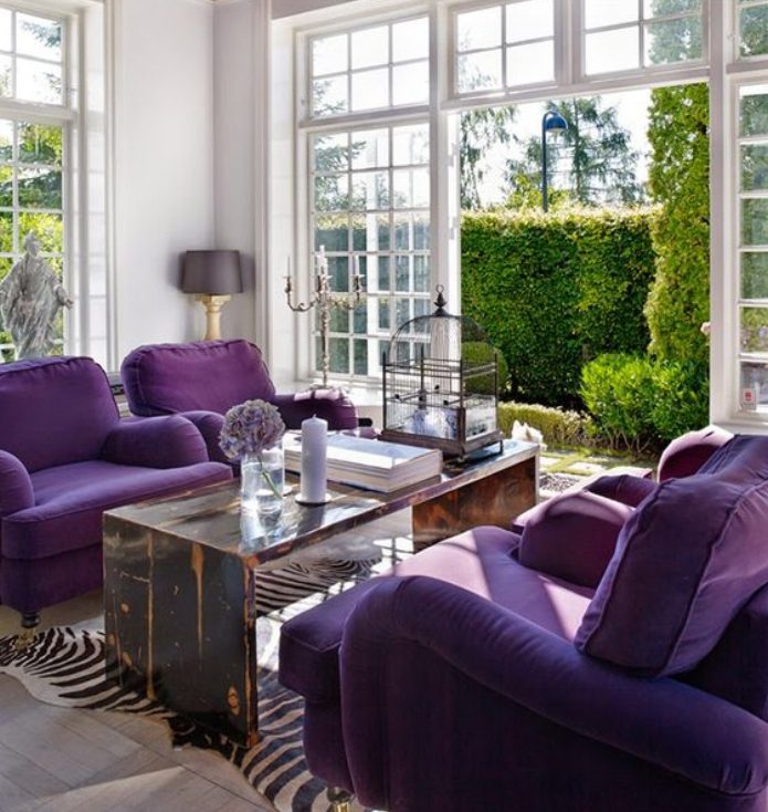
If you aren’t confident enough to mix these complementary colours within your interior spaces then try and look outside of your space to bring these colours together. For example, this room boasts exterior views of luscious leafy green gardens that sits perfectly with the violet upholstery within the interior.

If you fear mixing the right shades and tones of complementary colours, then drawing inspiration from fabrics can help you with this. Fabric designers are skilled in colour theory and colour design and will have done the hard work for you. This fabric from ROMO harmoniously blends violet tones with pops of zesty yellows to bring a fresh vibrant feel.
Analogous colours
Analogous colours are colours are a group of three colours that sit side by side on the colour wheel. In violets case, we are looking magenta and indigo. Used together, these colours will create a rich colour scheme so it is important to pair them sparingly to not overwhelm the space. 
To make this theory work for you, use one colour as the dominant tone and introduce the supporting colours as accents to the scheme. This interior uses indigo as the dominant tone and incorporates pops of magenta and violet shades to give this bedroom a rich, indulgent feel.

Using the same principles, you can create a lighter, fresher feel by using lighter shades within the palette. This image shows how the using lighter shades of blue, violets and magenta still add depth and interest to the neutral coloured upholstery and the softer colour palette of the room.
How can we use violet to create the perfect interior scheme?
Going back to the psychological effects of the colour and mindfully using it in small amounts, here are ways to best incorporate violet into your interiors.

Go bold and make a statement with your upholstery. This violet L shaped sofa works perfectly in it’s perfectly neutral setting. The careful placement of gold accessories add to the luxurious feel and the touches of black in the window frames help to balance out the bold colour.
Introduce oversized artwork. This piece gives the sense of having a painted feature wall but without committing to something more permanent. The violet coloured artwork works beautifully with its analogous pairing of indigo blue.

If you are bold enough to add a violet feature wall then Palentine by Little Greene is the perfect paint to do the job. Why not up cycle an existing piece of furniture if you have some paint left over to really give the wow factor.